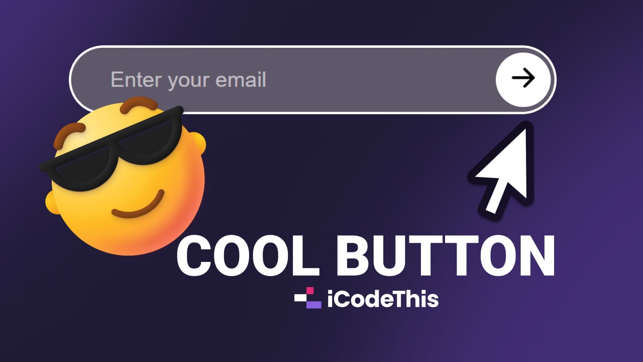
Placing a Button on Top of an Input using CSS
 byFlorinPop17on May 25, 2023
My friend Vlad from our Discord Community, asked me how I would place a button on top of the input, like this:
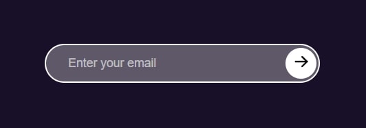
👆 Click on the image to see the live preview.
Let me break down the process for you step by step.
The process
The idea is quite simple actually, we're going to create a .wrapper div which will hold our input and button elements.
The input will take up the full width of the .wrapper so that later on, we can use CSS's absolute positioning to place the button exactly where we need it to go. Aka to the right side of the .wrapper.
And since the input is covering the entire .wrapper, the button is going to be placed perfectly on top of it by using top and left positioning.
Let's see the code.
The HTML
<div class="wrapper">
    <input type="text" placeholder="Enter your email" />
    <button>
        <!-- Icon or SVG -->
    </button>
</div>
As I mentioned above, we have a .wrapper that holds the input and the button which has the icon.
(In the live preview I used an svg for the icon but you can use whatever you want).
We also gave this div the class of .wrapper so that we can easily target it in CSS.
The CSS
First, we need to style the .wrapper. We can give it a fixed width and a max-width of 100% to make sure it's responsive out-of-the-box.
.wrapper {
    width: 400px;
    max-width: 100%;
    position: relative;
}
Very important here is the position: relative property. This will allow us later on to position the button relative to this wrapper.
Next, for the input, we'll add some basic styling and make it so that it takes up the whole .wrapper with width: 100%.
.wrapper input {
    background: rgba(255, 255, 255, 0.3);
    border: 2px solid white;
    border-radius: 50px;
    padding: 1rem 2rem;
    width: 100%;
}
The border-radius: 50%; will make it nice and rounded. Classy! 😎
And the last piece of the puzzle, the button styling:
.wrapper button {
    background: white;
    border-radius: 50px;
    aspect-ratio: 1;
    height: 100%;

    /* The important part */
    position: absolute;
    top: 0;
    right: 0;
}
Alongside the basic styling, we're forcing the button to take up 100% of the height of its parent (the .wrapper), and with aspect-ratio: 1, we're making it a square (as the width will now be equal to the height).
And the important piece: we're positioning the button absolute as this way we can place it wherever we want inside of its parent.
In this case we're giving it a top and right value of 0 because we want it to be placed on the right side.
As the height is 100%, this will make it so that it covers the input entirely.
If we want to have a little space between the button and the border of the input, we could do a little trick:
.wrapper button {
    height: 80%;

    top: 10%;
    right: 5px;
}
We can set the height to be 80% for example, and then we'll need to subtract that from the 100% total height of the wrapper to figure out the right top positioning.
So we get 20% remaining space which has to be split between the top and buttom "free space" available, hence why we divide by 2 and end up with setting the top property to 10%.
And since we want to move it a little bit to the right, we set a right value of 5px in this case, which just makes it look... noice! 🤩
Conclusion
As you can see it's quite fun to place elements using CSS positioning!
We could follow the same approach and place an X closing button on top of a modal or popup. If you'd like me to show you how, let me know and I'll write another article! 😁
Meanwhile, keep on codin'! 👩💻👨💻
Tags:CSSPositioning